Instagram Changes Logo After 10 Years
Instagram updates its logo, giving it a cleaner look. The new design retains the familiar script-inspired style but with softer curves.
'%3E%3Crect%20width%3D'96'%20height%3D'96'%20fill%3D'%23B3261E'%2F%3E%3Ccircle%20cx%3D'30'%20cy%3D'24'%20r%3D'44'%20fill%3D'%23fff'%20opacity%3D'.12'%2F%3E%3Ccircle%20cx%3D'60'%20cy%3D'74'%20r%3D'40'%20fill%3D'%23000'%20opacity%3D'.10'%2F%3E%3C%2Fg%3E%3Cg%20fill%3D'%23fff'%3E%3Crect%20x%3D'29'%20y%3D'49'%20width%3D'8'%20height%3D'19'%20rx%3D'1'%2F%3E%3Crect%20x%3D'39'%20y%3D'40'%20width%3D'9'%20height%3D'28'%20rx%3D'1'%2F%3E%3Crect%20x%3D'50'%20y%3D'45'%20width%3D'8'%20height%3D'23'%20rx%3D'1'%2F%3E%3Crect%20x%3D'60'%20y%3D'53'%20width%3D'7'%20height%3D'15'%20rx%3D'1'%2F%3E%3Crect%20x%3D'41'%20y%3D'34'%20width%3D'5'%20height%3D'6'%2F%3E%3C%2Fg%3E%3C%2Fsvg%3E)
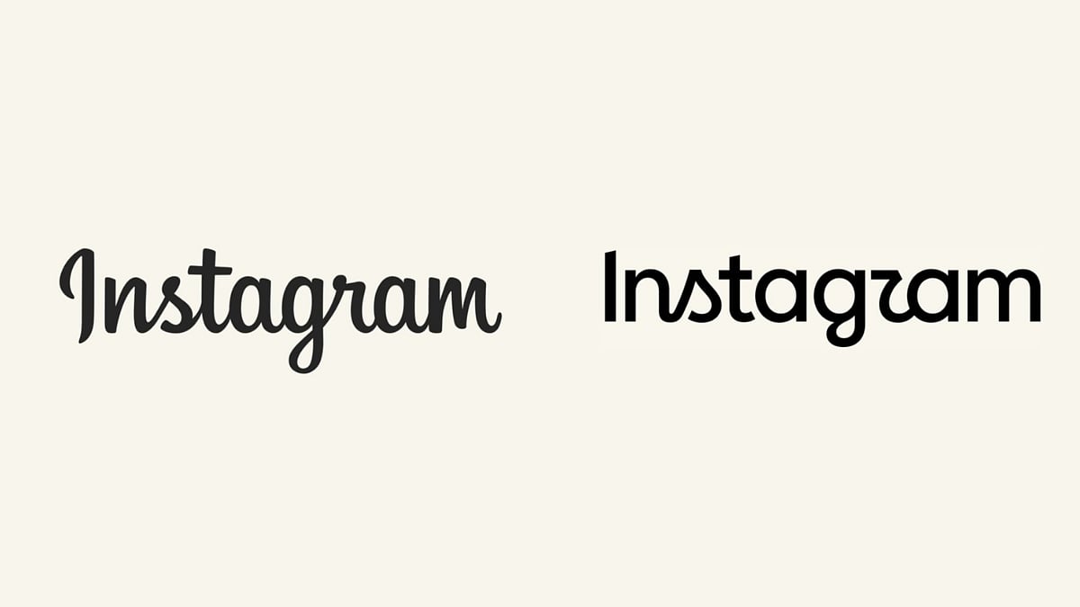
Instagram, a social media platform owned by Meta, has changed its logo after 10 years. The update was announced by Instagram chief Adam Mosseri through posts on Instagram and Threads. According to Mosseri, the wordmark at the top of the app hadn't changed in 10 years, so it was time for a refresh. The new design is described as cleaner and more modern, while still taking inspiration from Instagram's original look.
The updated wordmark retains the familiar script-inspired style but gives the lettering softer curves and a more contemporary, handwritten feel. Some of the differences become more obvious when comparing individual characters, particularly letters such as 's', 'g', and 'r', which have been subtly redrawn. The idea appears to be keeping Instagram recognizable while making the typography feel cleaner and more refined.
This change does not replace Instagram's recognizable gradient camera symbol or indicate a fundamental redesign of the app. The update is less of a dramatic makeover and more of a careful polish. The platform has redesigned its wordmark, marking its first such update in 10 years.
The internet has mixed feelings about the new logo. While some users appreciated the cleaner appearance, others wondered whether Instagram really needed to alter something so familiar. The reactions are varied, with some people loving the new design and others preferring the old one.
Instagram's decision to update its logo after 10 years is a significant one. The platform has been growing and evolving over the years, and the new logo reflects this change. The update is a testament to the platform's commitment to staying modern and relevant.
The new logo is not a drastic change, but rather a subtle update that refreshes the platform's visual identity. The update is likely to be well-received by users who are looking for a cleaner and more modern design. However, some users may take time to get used to the new logo, especially those who are attached to the old design.
In conclusion, Instagram's new logo is a welcome update that gives the platform a fresh and modern look. The update is a testament to the platform's commitment to staying relevant and modern, and it is likely to be well-received by users.
The change in logo is also a reflection of the platform's evolution over the years. Instagram has been growing and changing, and the new logo reflects this change. The update is a sign that the platform is committed to staying modern and relevant, and it is likely to be a positive change for users.
Overall, the new logo is a positive update that gives Instagram a fresh and modern look. The update is a testament to the platform's commitment to staying relevant and modern, and it is likely to be well-received by users.
The new logo is now available on the platform, and users can see the updated design when they log in. The update is a subtle but significant change that reflects the platform's evolution over the years.
In the end, the new logo is a welcome update that gives Instagram a fresh and modern look. The update is a testament to the platform's commitment to staying relevant and modern, and it is likely to be well-received by users.
Frequently asked questions
Why did Instagram change its logo
Instagram changed its logo after 10 years to give it a cleaner and more modern look.
What is different about the new logo
The new logo has softer curves and a more contemporary, handwritten feel, while still retaining the familiar script-inspired style.